Tripgic Brand Kit
The single source of truth for the Tripgic brand: approved logos, icons, favicons and social media assets, with the guidelines for using them. Free to download for customers, partners, media and designers.
Last updated
Brand overview
Tripgic is the unified B2B travel API: one integration that gives OTAs, corporate booking platforms and travel-tech startups flights from Amadeus, Sabre and Travelport, IATA NDC airline-direct offers, low-cost carriers, hotels and more. Tripgic is a division of Innovate Solution Global Pte. Ltd.
The identity is built on two ideas. The T mark leads the wordmark with a sharp, forward-leaning stroke — speed and precision. The “pg” ligature joins two letters into a road with a dashed centre line — the routes, connections and journeys the platform moves. One confident red, generous white space and clean geometric type complete the system.
- ConnectedOne API, every supplier.
- FastBuilt for real-time travel.
- ReliableEnterprise-grade, precise.

Primary logo
The Tripgic wordmark is custom lettering and the primary brand signature. Use it in Tripgic Red on light backgrounds and in white on red or dark backgrounds. Always use the supplied files — never redraw or retype it.

Primary logo — full colour
Tripgic Red wordmark. The default choice on white and light backgrounds.



Reversed logo — white
For Tripgic Red, dark backgrounds and photography.



Dark-background logo
White wordmark on Midnight (#020617) for dark UI, decks and video.


Monochrome — black
Single-colour print, stamps, engraving and fax. Never for normal digital use.



Logo on white (with clear space)
Ready-made file with the 2X clear space built in.

Logo on red (with clear space)
Matches the brand style sheet's reversed master.
Secondary logos & icons
Lockups add the “Travel API Platform” descriptor or the app-icon tile. The T mark and the “pg” monogram are for spaces too small or too square for the full wordmark — they never replace it where it fits.

Horizontal lockup
Wordmark with the “Travel API Platform” descriptor — headers, decks, event screens.



Vertical lockup
App-icon tile stacked above the wordmark — square and portrait spaces.

Tagline lockup
Descriptor set to the full wordmark width — print, merchandise, footers.




Icon — the T mark
The first letter of the wordmark. Favicons, app icons, avatars and small spaces.



Monogram — the “pg” route
The road ligature from the wordmark. Secondary app icon and brand accent.


App icons
1024 px App Store masters and rounded previews in red and white.



Clear space & minimum size
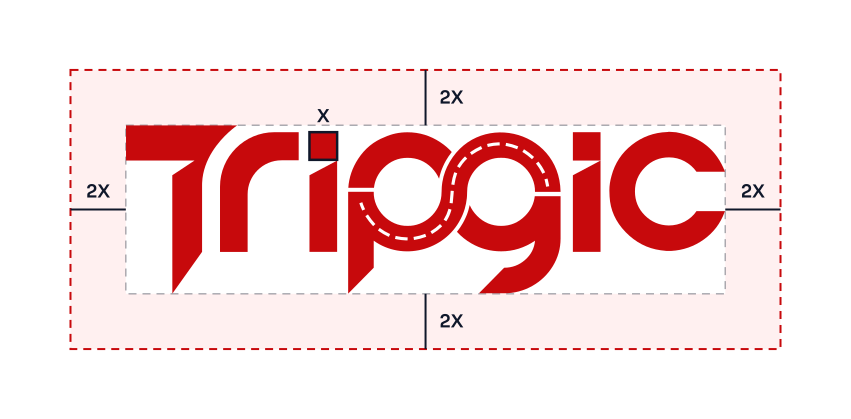
X is the width of the square dot on the “i”. Keep a clear space of at least 2X on every side, free of text, images, other logos and edges.
| Asset | Digital minimum | Print minimum |
|---|---|---|
| Wordmark | 96 px wide | 25 mm wide |
| Lockups | 160 px wide | 40 mm wide |
| Icon / app tile | 16 px | 6 mm |
Below the wordmark minimum, switch to the T icon. The descriptor in lockups must stay legible — if it falls under 8 px tall, use the plain wordmark.
Approved & prohibited usage
Do
Don’t
Also don’t: crop or cut off any letter, rearrange or separate the letters, combine the logo with another mark to create a new one, place it inside a shape other than the approved app tile, or use it in a way that suggests a partnership or endorsement that doesn’t exist.
Colour palette
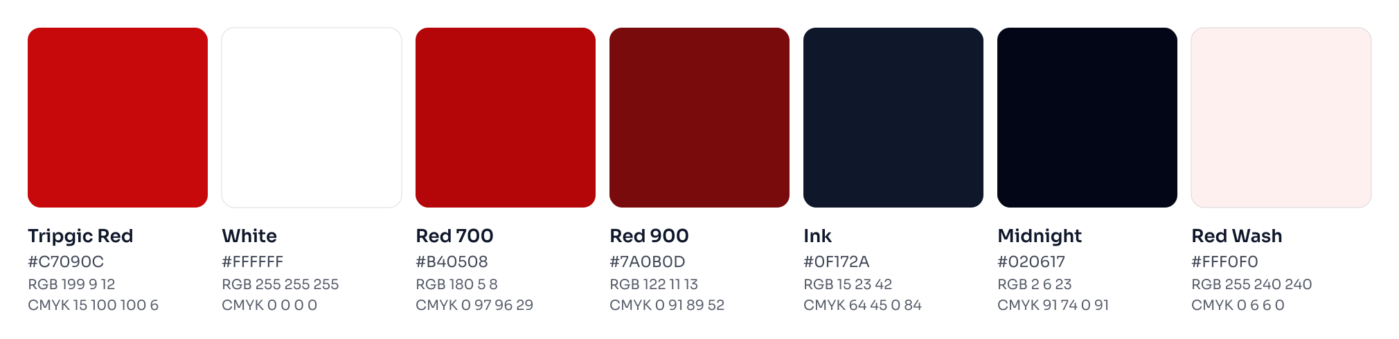
Tripgic Red and White are the brand colours. Tripgic Red is exactly #C7090C — never brightened, darkened or approximated. The supporting colours are for interface states, text and dark surfaces. Click any HEX or RGB value to copy it.
- HEX
- RGB
- CMYK
- 15 / 100 / 100 / 6
Primary brand colour — logo, primary buttons, key emphasis
- HEX
- RGB
- CMYK
- 0 / 0 / 0 / 0
Base brand colour — backgrounds, reversed logo
- HEX
- RGB
- CMYK
- 0 / 97 / 96 / 29 (approx.)
Hover and pressed states, tone-on-tone graphics
- HEX
- RGB
- CMYK
- 0 / 91 / 89 / 52 (approx.)
Deep accent, high-contrast red text on light
- HEX
- RGB
- CMYK
- 64 / 45 / 0 / 84 (approx.)
Headings, body text, dark hero surfaces (slate-900)
- HEX
- RGB
- CMYK
- 91 / 74 / 0 / 91 (approx.)
Footer and darkest surfaces (slate-950)
- HEX
- RGB
- CMYK
- 0 / 6 / 6 / 0 (approx.)
Faint highlight backgrounds (tripgic-50)
CMYK for Tripgic Red and White is the official print specification. Values marked “approx.” are converted from RGB — ask your printer to match against a proof. For spot-colour printing, match Tripgic Red visually to a coated swatch book.
Typography
The logo is custom lettering. Around it, Tripgic uses three free, open-source typefaces (SIL Open Font License): modern, geometric and highly readable.
Display
Sora
One API for every journey
Headlines, titles, UI labels and social graphics. SemiBold 600 for headings, Bold 700 for heroes; tracking −0.02em.
Get Sora on Google FontsText
Inter
Search, price and book flights, hotels and more through one normalized JSON API.
Body copy, tables and forms. Regular 400, Medium 500, SemiBold 600; 16–18 px with 1.6 line height.
Get Inter on Google FontsCode
JetBrains Mono
DAC → SIN · 2 ADT · Y
API samples, endpoints, JSON, airport and airline codes. Regular 400, Medium 500.
Get JetBrains Mono| Style | Font & weight | Size (web) | Use |
|---|---|---|---|
| H1 | Sora 700 | 48–60 px | Page titles, hero |
| H2 | Sora 700 | 30–36 px | Section titles |
| H3 | Sora 600 | 20–24 px | Cards, sub-sections |
| Body | Inter 400 | 16–18 px | Paragraphs, lists |
| Label | Inter 700, +0.12em | 11–12 px | Eyebrows, badges |
| Code | JetBrains Mono 400 | 13–14 px | API examples |
Fallbacks: Sora, "Segoe UI", system-ui, sans-serif · Inter, "Segoe UI", Roboto, Arial, sans-serif. Office documents without the brand fonts may use Segoe UI or Arial.
Iconography & visual elements

The T mark
Brand icon for favicons, app icons and avatars. On a tile, use a 22% corner radius and keep the mark at about 56–62% of the tile height.
The route ligature
The “pg” road with its dashed centre line. A secondary mark and the source of the road motif — never rebuilt, rotated or used as a letter in other words.
Road motif
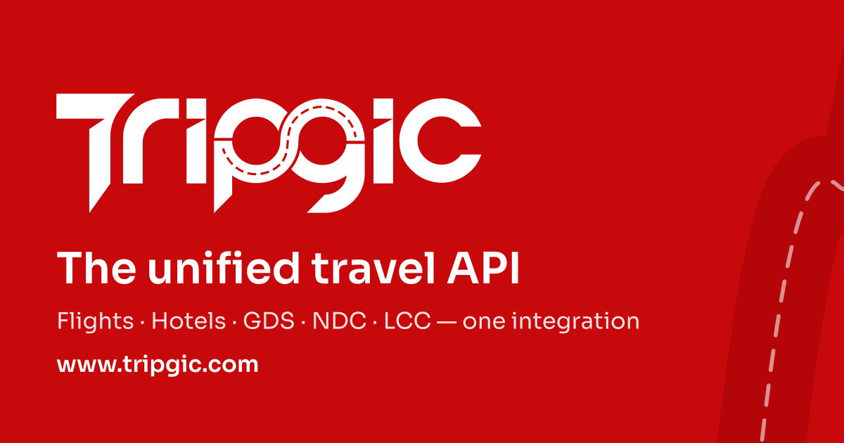
On covers and banners: a wide tone-on-tone road in Red 700 with a white dashed centre line, running behind content — never through the logo or text.
UI icons: Lucide outline icons, 2 px stroke, rounded caps, 16–24 px, in Tripgic Red or Ink on a 10% red tile. Don’t mix filled and outline icon sets. Social network logos follow each network’s own brand rules.
Backgrounds & contrast
Pick the logo for the background, not the other way round. Light backgrounds take the red logo; Tripgic Red, dark colours and photographs take the white logo. On photography, place the logo over a calm, even area or a 40–60% dark overlay. Text must meet WCAG 2.1 AA (4.5:1 for body text).
| Sample | Combination | Contrast | WCAG | Use |
|---|---|---|---|---|
| Aa | White on Tripgic Red | 6.0:1 | Pass AA | Logo, headings, buttons |
| Aa | Tripgic Red on White | 6.0:1 | Pass AA | Logo, links, buttons |
| Aa | White on Ink | 17.9:1 | Pass AA | Dark heroes, footers |
| Aa | Ink on White | 17.9:1 | Pass AA | Body text |
| Aa | Tripgic Red on Ink | 3.0:1 | Fail | Avoid — use white logo |
| Aa | Tripgic Red on Red 700 | 1.2:1 | Fail | Never |
Favicons & app icons
The white T mark on a Tripgic Red tile. Small sizes (16–48 px) are hinted with a slightly larger mark so it stays crisp in browser tabs. The set covers every modern browser, iOS, Android, PWA install and Windows tiles.









HTML — paste inside <head>
<link rel="icon" href="/favicon.ico" sizes="48x48">
<link rel="icon" href="/assets/brand/favicon/favicon.svg" type="image/svg+xml">
<link rel="icon" href="/assets/brand/favicon/favicon-32x32.png" type="image/png" sizes="32x32">
<link rel="icon" href="/assets/brand/favicon/favicon-16x16.png" type="image/png" sizes="16x16">
<link rel="apple-touch-icon" href="/assets/brand/favicon/apple-touch-icon.png" sizes="180x180">
<link rel="mask-icon" href="/assets/brand/favicon/safari-pinned-tab.svg" color="#C7090C">
<link rel="manifest" href="/assets/brand/favicon/site.webmanifest">
<meta name="theme-color" content="#C7090C">
<meta name="msapplication-TileColor" content="#C7090C">
Download brand resources
Download everything at once, or only the package you need. Every ZIP includes a README with the core usage rules. Individual files are linked in each section above.
By downloading, you agree to use Tripgic brand assets only to refer to Tripgic and in line with these guidelines. Need a format that isn’t here? Email support@tripgic.com.
Brand kit FAQ
Can I use the Tripgic logo?
Yes. Customers, partners, media and integrators may use the Tripgic logo to refer to Tripgic or to show an integration with the Tripgic API, provided the logo is used unaltered and as described in these guidelines. Using the logo does not imply a partnership or endorsement unless one has been agreed in writing.
Which logo file should I use?
Use SVG wherever it is supported — websites, apps and design tools — because it stays sharp at any size. Use transparent PNG for documents and slides, and the JPG or PNG files with a built-in background where transparency is not supported.
Which logo goes on a dark or coloured background?
Use the white (reversed) logo on Tripgic Red, dark backgrounds and photography. Use the red logo on white or very light backgrounds. The black logo is only for single-colour print.
What is the exact Tripgic brand colour?
Tripgic Red is HEX #C7090C, RGB 199 9 12 and CMYK 15 100 100 6. It is the only brand red; do not brighten, darken or approximate it.
Can I change the logo colour or add effects?
No. Do not recolour, stretch, rotate, outline, add shadows or gradients to, or rebuild the logo, and do not retype the name in a font. Only the approved red, white and black versions may be used.
Who do I contact about brand use or press?
Email support@tripgic.com with your request. For approval of co-branded material, include a preview of how the logo will appear.
Writing about Tripgic or building with us?
For press enquiries, co-branded material approvals or partnership announcements, get in touch — we usually reply within one business day.
Social media branding
Profile pictures
Use the red wordmark on white on every platform, so Tripgic is recognisable in every feed. Files are circle-safe — nothing is cropped by round avatars.
Covers & banners
Tripgic Red with the white wordmark and the road motif. All text sits inside each platform’s safe area, clear of profile pictures and mobile crops.
Consistency
Same name (“Tripgic”), same avatar and the handle pattern tripgic wherever available. Don’t use filters or frames on the avatar.
Sizes follow each platform’s current recommended upload dimensions (November 2026). Platforms change specs from time to time — the assets are produced from vector, so new sizes can be generated without quality loss.